Introduction
Spare change adds up, and Questrade RoundUp allows users to take advantage of this. Questrade RoundUp enables users to save as they spend. This new feature rounds up credit card purchases or expenses to the nearest dollar and saves the difference in a diversified investment portfolio. The goal of this project is to create a seamless sign-up experience for both existing and new users by providing them with information that is clear, direct, useful and understandable.
My role and responsibility
I designed a full UX writing process and deliverables – from research, voice definition, and final copy.
What I did
- Competitive Analysis
- User Research
- Designing and writing for different screen
Competive Analysis
I analyzed three competitors that provided the same service by comparing their various copy styles, feature naming conventions as well as the entire user experience as follows:

WEALTHSIMPLE
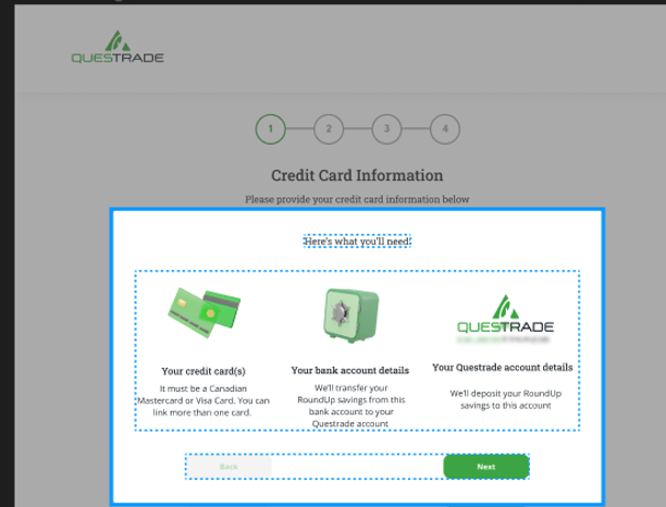
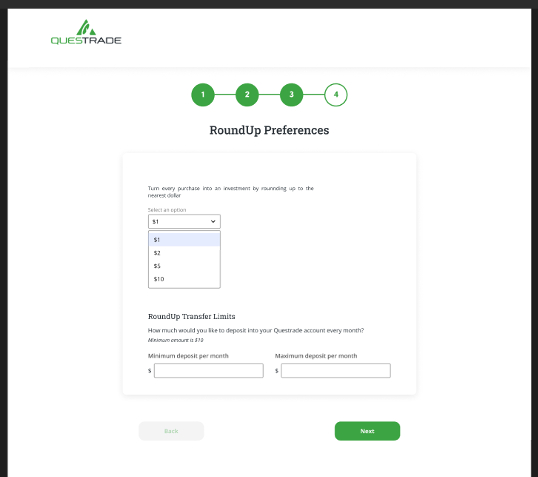
Feature name: Wealthsimple Roundup.
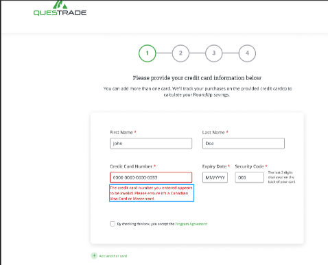
Accessibility & User experience: Difficult to access and only available on the app.
Recommendation
Copy style:
Our copy style should be clear, fresh, human, and understandable.
Feature name:
Research shows that people are already familiar with the term “Roundup”. I will recommend we adopt the same naming convention. For differentiation purposes, we can name it Questrade RoundUp.
Accessibility & User experience:
Accessibility is important. We should ensure that our users can access this feature with ease on our website and mobile app.
User research
I researched and built user persona from Questrade’s core target audience, focusing on identifying their needs, aspirations, and values. Also, publicly available resources and tools (social media platforms, blogs, Google Trends, forums, reviews & comments) were used to uncover more insights about the target audience- their language, pain points, and frustrations.

User Persona
Meet Ken
Age– 29
Work– Project Manager
Family- Single
Location- Toronto
Bio: Ken is a project manager at a tech start-up. He’s a frequent shopper and often uses her credit cards to make payments and purchases. He believes in investment and savings, but struggles to keep up with the habit
Goals:
Wants to make smart investments
Wants to pay off student loans
Frustrations:
Bad saving habits.
Fails to make any tangible investments
Recommendation
Based on the insights gained from Ken, I came up with the following recommendations for the digital experience and copy.
Deposit notifications:
We should provide users the opportunity to receive alerts and notifications whenever a RoundUp savings deposit is made to their Questrade account.
Questrade RoundUp Calculator:
Some people still struggle with the concept of RoundUp. To aid better understanding, we should include a RoundUp calculator to give users an idea of their savings and how to calculate it.
FAQs:
Because we are introducing a new feature, it’s important to have a detailed FAQ that answers specific queries our users might have.
Tone and Voice
Helpful & Human
We provide users with just enough information needed to complete their actions or enjoy their experience and we speak and treat our customers like friends.
Assuring & Empathetic
We understand that investment is serious, and we are here to help you reach your savings and investment goals in a supportive and transparent way.
Direct, Clear & Concise
We want our users to grasp the information when they use or sign up for RoundUp. We don’t want them to feel lost or abandon the task.
Designing & Writing Copy For Different Scenarios
My research findings influenced my copy style, flow and design elements for this project.
By following UX writing best practices, I wrote for some screens and scenarios.


Project Summary
During this project, I evaluated market research, ran a quick survey, created wireframes, and wrote copy for the screens. I focused on making the copy clear, direct, conversational, and aligned with the brand’s voice and tone.
Given less stringent timelines, I would have loved to conduct content testing for more accurate messaging and a deeper understanding of the brand’s style and voice. I also would have incorporated additional design elements, such as FAQs and a RoundUp Calculator.
One key takeaway was realizing how essential UX research is to UX writing. I also learned that UX is most effective when users can navigate content effortlessly, in a simple, scannable way. That’s exactly what I aimed to achieve.